Finch Motor Company Identity Guide

Our Colour Philosophy
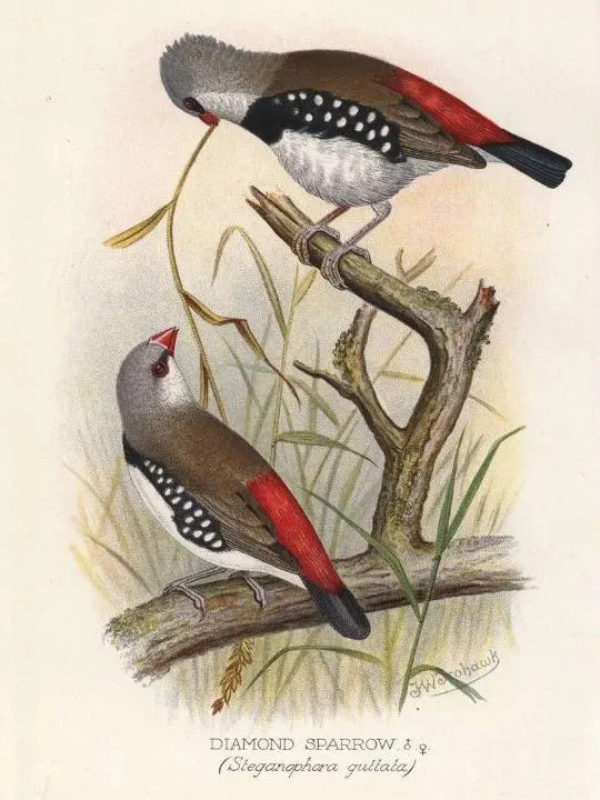
At Finch Motor Company, colour is the silent ambassador of our brand. Inspired by the vibrant hues of the Diamond Firetail Finch, our colours mirror the bird's vivacity and the rich landscapes of our South Australian home.
The Diamond Firetail is endemic to south-eastern Australia, ranging from Carnarvon Ranges in Queensland to the Eyre Peninsula and Kangaroo Island in South Australia.
These namesake birds represent a fusion of heritage and innovation — the hallmark of our commitment to the art of vehicle restoration and customisation.
Understanding Our Palette
Our palette is carefully curated to convey the essence of our brand across all mediums — from print and fabric to the digital screen.
This webpage defines how we articulate our identity through colours.

Our Palette for Print-Media
The colours in our print-media colour palette are chosen for their ability to translate the vibrancy and depth of our brand onto various print materials, ensuring that our visual identity remains consistent and impactful in all print forms.
Primary Colours
In crafting our visual language for print media, we've chosen colours that embody the essence of our brand. From the robust and profound Bold Red that grounds our brand, to the passionate Creative Scarlet that pulses through it, culminating in the vivacious Raspberry Wine that invokes our innovative spirit.
Our primary palette is a symphony of colours:

- Bold Red (Pantone 187 C | #A6192E)
Bold Red symbolises passion, power, strength, courage, love, and energy. This red is consistent and vibrant across all media, ensuring our brand remains visually cohesive.

- Creative Scarlet (Pantone 188 C | #76232F)
Scarlet is a rich and vibrant colour that exudes passion, energy, and boldness. Its deep red hue catches the eye and commands attention. Scarlet has a long history of being associated with power, desire, and luxury.

- Raspberry Wine (Pantone 703 C | #B83A4B)
A vibrant, energetic red that captures an innovative spirit. It works harmoniously with Bold Red, creating a bold and vibrant colour palette.
Supporting Neutrals
- White (#FFFFFF)
White signifies clarity and precision, serving as a clean slate within our visual identity.

- Elegant Darkness (Pantone Black 6 C | #101820)
Elegant Darkness, a deep and rich black, exudes sophistication and excellence. It has historically symbolised power and wealth, particularly during the Art Deco movement of the 1920s, where it became synonymous with luxury and elegance.

- Elegant Gray (Pantone Cool Gray 11 C | #53565A)
Elegant Gray, a cool-toned grey, exudes sophistication and timelessness. It became a symbol of the rise of modern manufacturing and technology during the industrial revolution and is often associated with professionalism and timeless elegance.

- Warm Gray (Pantone Warm Gray 5 C | #ACA39A)
Warm Gray complements our reds with its subtle warmth and versatility, adding a touch of humanity to our palette.
Metallic and Non-Metallic Accents
In addition to our primary and supporting colors, we incorporate Pantone 871C for a touch of luxury and sophistication. When metallic ink is not viable, use the non-metallic counterparts provided to maintain brand consistency.
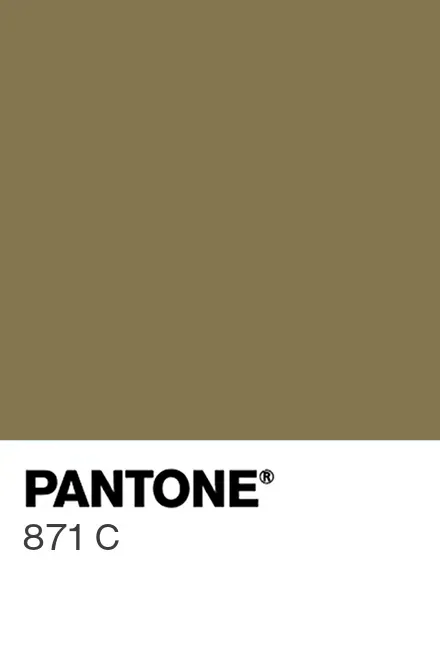
- Metallic Gold (Pantone 871 C Metallics Coated | #84754E)
Used for special features, highlights, and premium materials to add a luxurious touch.

- Metallic Gold (Pantone 871 C Solid Color Coated | #84754E)
Used in digital formats and general communication where metallic ink is not viable.
Vintage-Themed Primary Color
For documents like our Step-by-Step Guide Booklet, we incorporate a vintage-themed version of our primary color to ensure aesthetic harmony with the overall design.

- Raspberry Wine (Pantone 703 C | #B83A4B)
A vibrant, energetic red that captures an innovative spirit. Its deeper, warmer hue fits well within a vintage aesthetic.

Our Palette for Web & Digital
Our digital palette is designed to prioritise accessibility while maintaining visual impact. We use colours that ensure readability and endeavour to adhere to WCAG 2 AA standards for accessibility, reflecting our commitment to inclusivity in the digital space.
Crimson Red (#990000) serves a distinct role in digital communications compared to Bold Red (#A6192E) used in printed materials. For documents intended for both digital and print mediums, we recommend creating separate versions to optimise each format. However, if producing two versions is not viable, the document should be crafted for print utilising Bold Red, Creative Scarlet and/or Raspberry Wine to maintain colour integrity.

Our Palette for Fabrics and Functional Materials
For fabrics and functional materials, we have selected colours that are readily available and align with our brand's aesthetic. This ensures consistency and recognisability for our team's attire and our physical branding materials.
Preferred Fabric Matching Colours
To maintain practicality and cost-effectiveness, we select fabrics and garments with colours closely matching our brand. Our uniformity principle leads us to adopt uniform garments consistently available in the market. New garments appearing in closer shades to our primary brand colours are tempting but might disrupt our desired uniformity.
For items like marquees, tautliners, and trailer tops, we have identified a small range of vinyl colours. Greys and blacks are acceptable alternatives, but for red vinyls, we prefer colours that are as close to our brand colours as possible.
Our preferred standard colours for uniform fabrics and similar functional materials are:

- Pantone 187 C (#A6192E)
Pantone 187 C is ideal for matching shiny vinyls. Its vibrant hue is perfect for items that require a glossy finish, offering a visually appealing and consistent colour match.

- Pantone 186 C (#C8102E)
Pantone 186 C is suited for matching non-shiny cloth materials to our existing uniform range. Widely used in uniform production, this colour offers a reliable and consistent match with existing uniform stocks, enhancing uniformity across our range.

- Pantone 19-1763 TPX Racing Red (#B81B36)
Pantone 19-1763 TPX (Racing Red) is included for its relevance in textile applications, providing an additional reference for consistency in fabric-based products. It is very similar to our primary red which remains as Pantone 187 C.
Guiding Principles for External Suppliers
This guide serves as a compass for our external partners, ensuring that every component and communication reflects the Finch Motor Company ethos. Our colours are more than mere decoration; they're a commitment to our brand's story, a story we proudly share with every client and collaborator.
